Monday, October 22, 2012

Final Print


1. In this project, I achieved balance by creating an even amount of positive and negative space. Movement can be seen in the mane because of the texture.
2. I added texture to my print by cutting small lines for the mane and other body hair. This took a lot of concentration because I didn't want the indents to be too big, but they needed to be large enough to the point where they would show up. I added contrast by using a dark color paint and a light colored sheet of paper. Texture and contrast were important in this project because with out them, it would be nearly impossible to see the image.
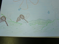
3. I used positive space to show the silohuette of the lion and the sky in the background. The negative space included the grass and the mountains in the background as well as the eyes, nose, mouth, ears, and mane.
4. Overall, the craftsmanship of of my print is pretty good. There are a few spots that weren't cut deep enough, so they got filled with paint and didn't show up in the print. Other than that, it is very easy to tell that my print is a picture of a lion.
5. I was able to achieve depth by putting the lion in the foreground, the grass in the middle ground, and the sky and mountains in the background.
6. Overall, I enjoyed this project. We got to use new tools and got the chance to paint the tabels!!! (but then had to clean it up later) The main obstacle I encountered was making sure the print distributed the paint evenly. For some reason there were a few spots on the print that the paint would not stick to. Other than that, I really enjoyed this project.

Thursday, October 4, 2012

Print Making


1. Texture is important to have in our sketches because it makes the image so much more interesting. For example, the mane and whisker spots of my lion sketch make it look much more realistic than if I just didn't include them. Also, the texture of the grass in the background really brings the scene to life.
2. It is necessary to have multiple references of each animal and each background so that we can combine different characterisitics of each to make the print specific to us. In my drawing, I combined the view of a standing, white lion with the characteristics of a normal brown lion. Then, I combined a mountaneous background with a saharan background. 
3. When I looked at my sketches, it was very easy to see which one would come out as the best print. I chose the lion because it had the most texture and detail to it. I also chose it because it is fierce, just like me! 

Chalk Murals

1. For some odd reason, I was a team captain. GO FIGURE! We each had 4 or 5 people on our teams and were directed to come up with 10 different ideas. We then had to choose our favorite one and draw it out on paper.


 2. Next, we chose a spot in the courtyard to draw our murals. We had to assign jobs in order to manage our time correctly. So while the boys colored in the Queen Jellyfish, Rachel and I woked on the smaller jellyfish and Patrick Star.


3. Unfortunatley, later that day it completely downpoured, so all of our work was washed away. The next day we had to start from scratch, and that really set us back. Because of this unfortunate event, we were not able to include all of the fine details we wanted to.


4. Creating art work that the whole school could work with was a blast. Every time someone walked by, we got a complement. Obviously, jellyfishing is just something that everyone has always wanted to do!!